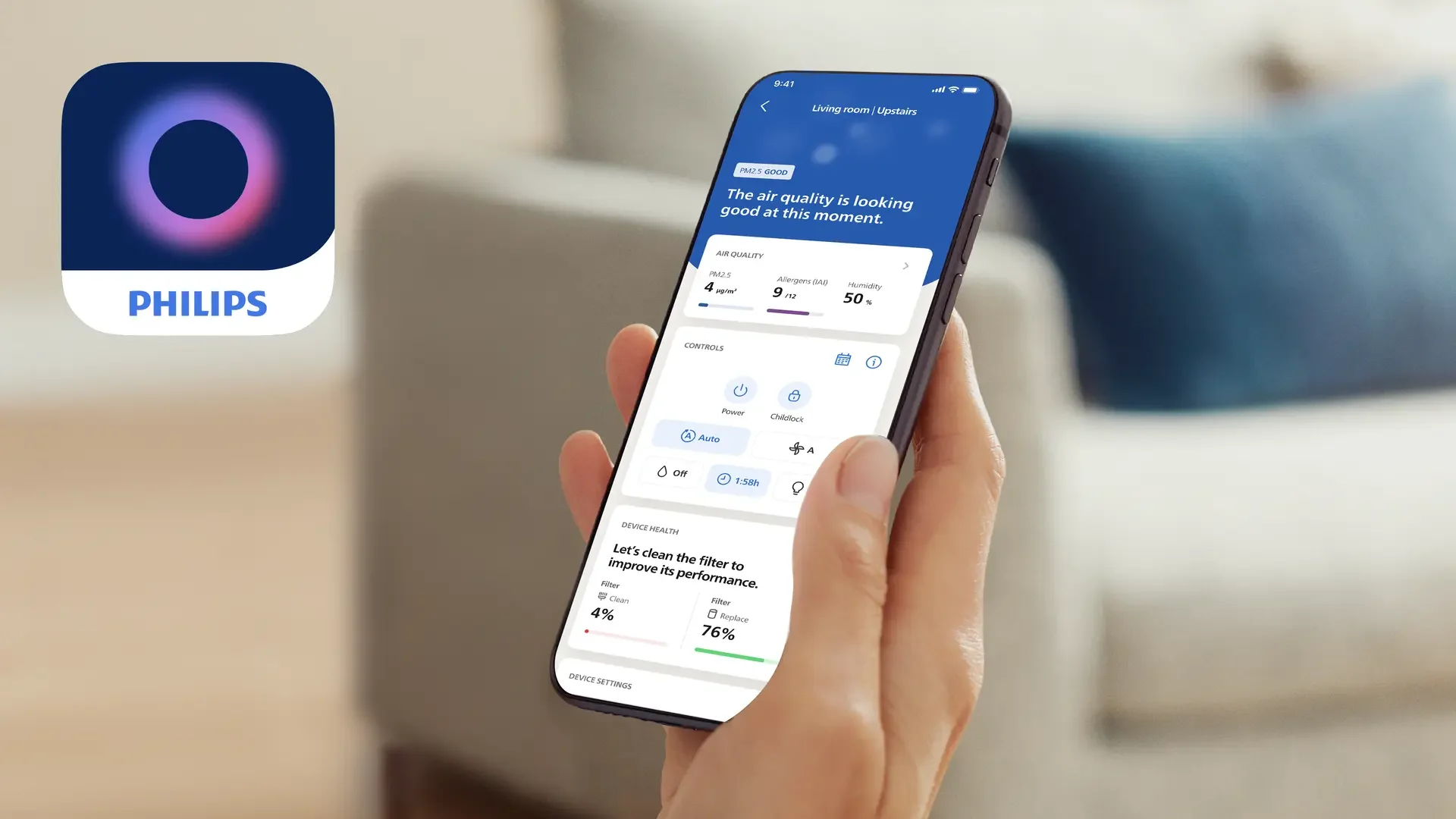
Philips Air+ app
A full rebrand of the Philips Clean Home+ app
Company
AKQA Amsterdam
brief
approach
approach
Role
Area
ACD
AI integration
Branding
UX/UI
Scope
A full rebrand of the Philips Clean Home+ app, including a new name, app icon and the integration of AI-features
A complete overhaul of the former Clean Home+ app, including app name and icon, plus the integration of different AI features
insight
With its invisible and intangible output, it’s hard for users to know if their air purifier delivers on the promise of clean air
Philips’ range of air purifiers and humidifiers provide cleaner and healthier indoor air.
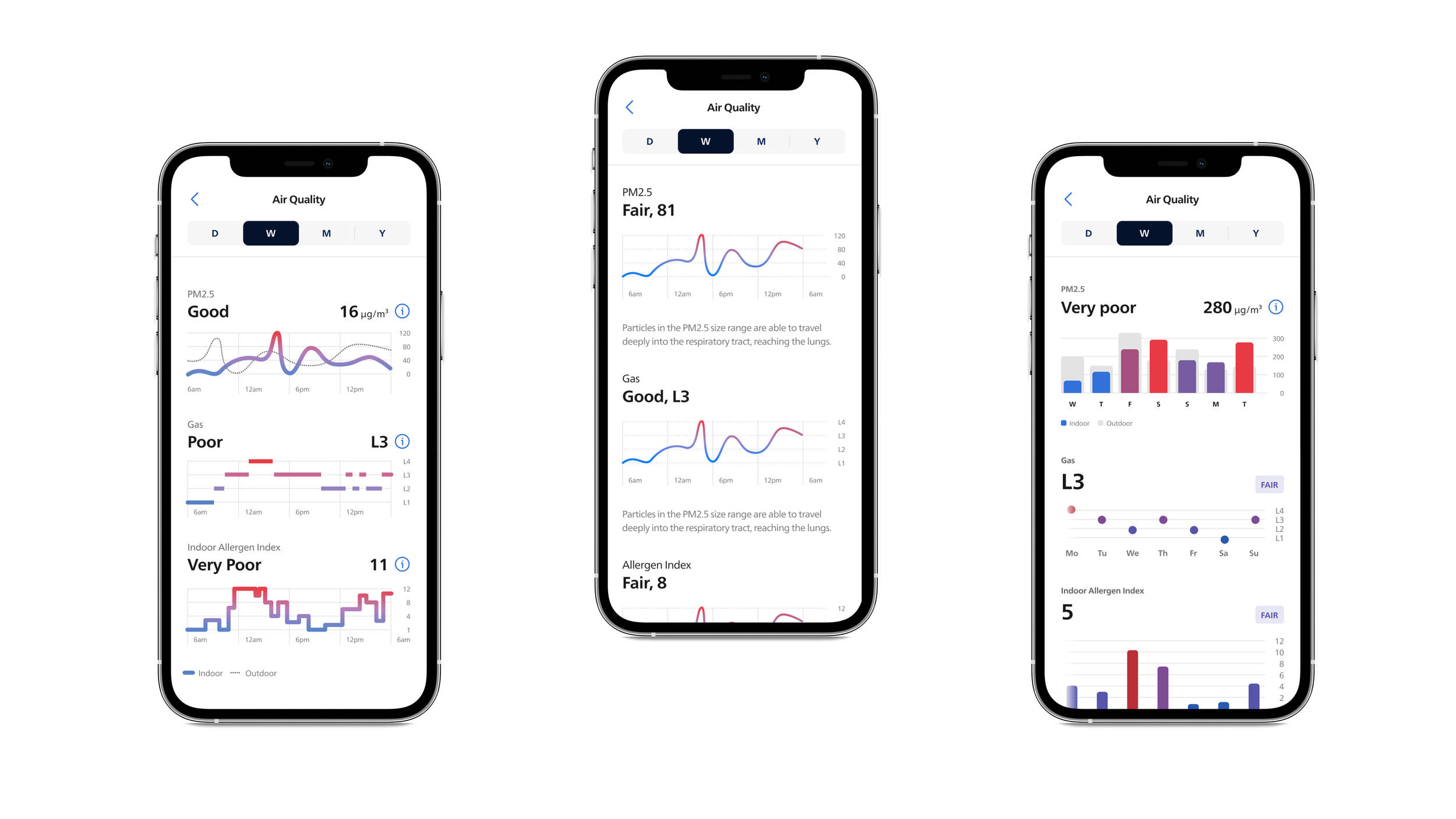
But as the output of these devices is intangible and invisible, the former Philips Clean Home+ app had to, on top of being a remote control, provide the reassurance that the device is delivering on its promise of cleaner, healthier air. However, the app’s wealth of quantitative date was perceived by users as too technical, irrelevant and hard to comprehend due to a lack of context and poor design.
Rather than providing reassurance, users mentioned confusion and frustration as the data didn’t inform them how to get the best out of their device.
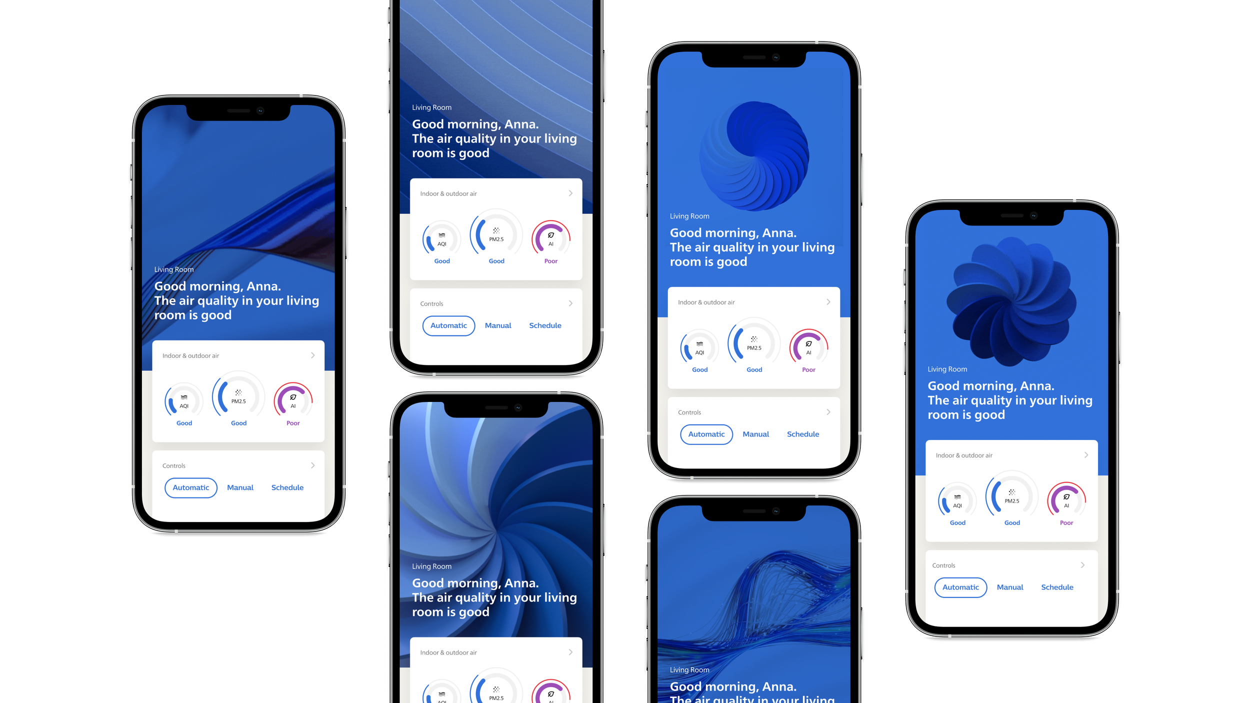
From static dashboard to reassuring companion app
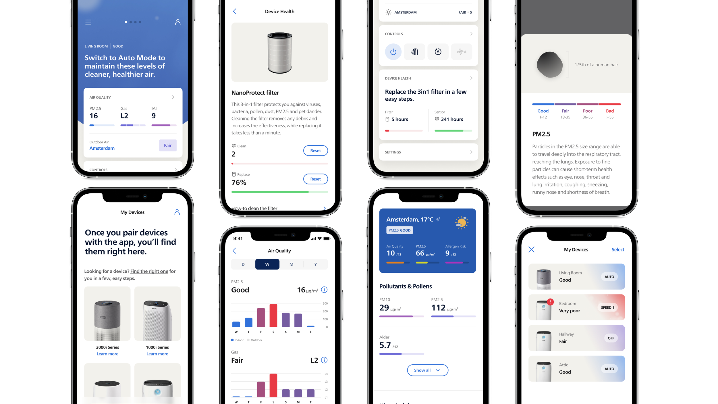
The goal was to transform the data-driven Clean Home+ app into a personalised hub where users — through encouragement, clear instructions and suggestions — feel reassured and secure about the air they breathe.
The app’s main focus is on the indoor air quality, which is expressed through the use of colour, motion and language. Through an updated onboarding flow, users provide insights into their air quality concerns and living situation so the app can provide immediate reassurance in the area(s) of concern.

A more intuitive, user-friendly experience
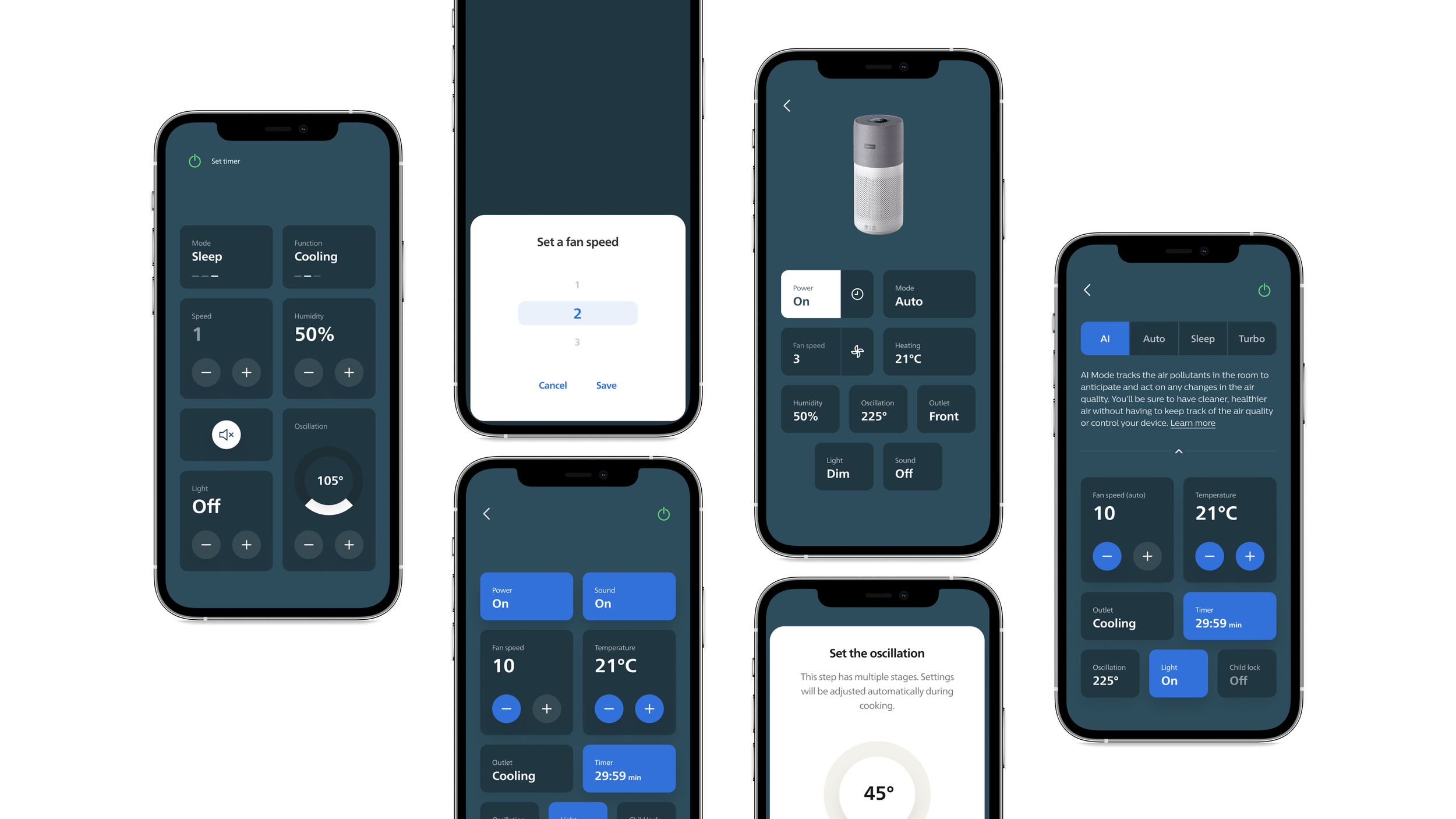
The device’s remote was redesigned to be more recognisable as such. This made for a less copy-heavy and more intuitive design, which increased the usability. We also introduced brief descriptions for each mode to help users make a well-informed decision on which one to use in which moment.
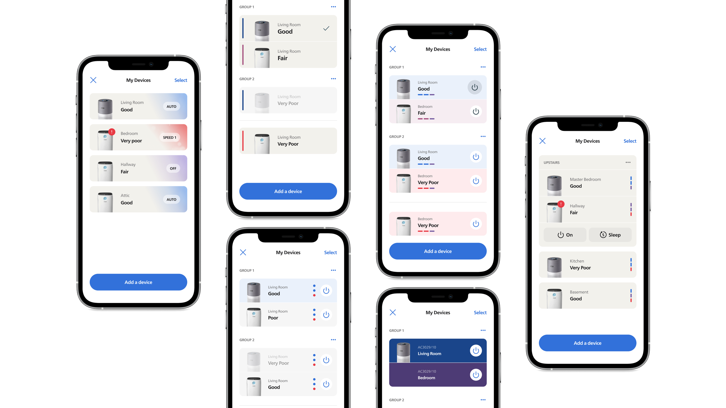
The last area to improve was My Devices. While most users own a single device, our challenge was to design a comprehensive overview that would show the status of each device at a glance, and change settings in just a tap.
execution
After a five week Discover and Identify phase, the MVP was executed in five, 2-week sprints
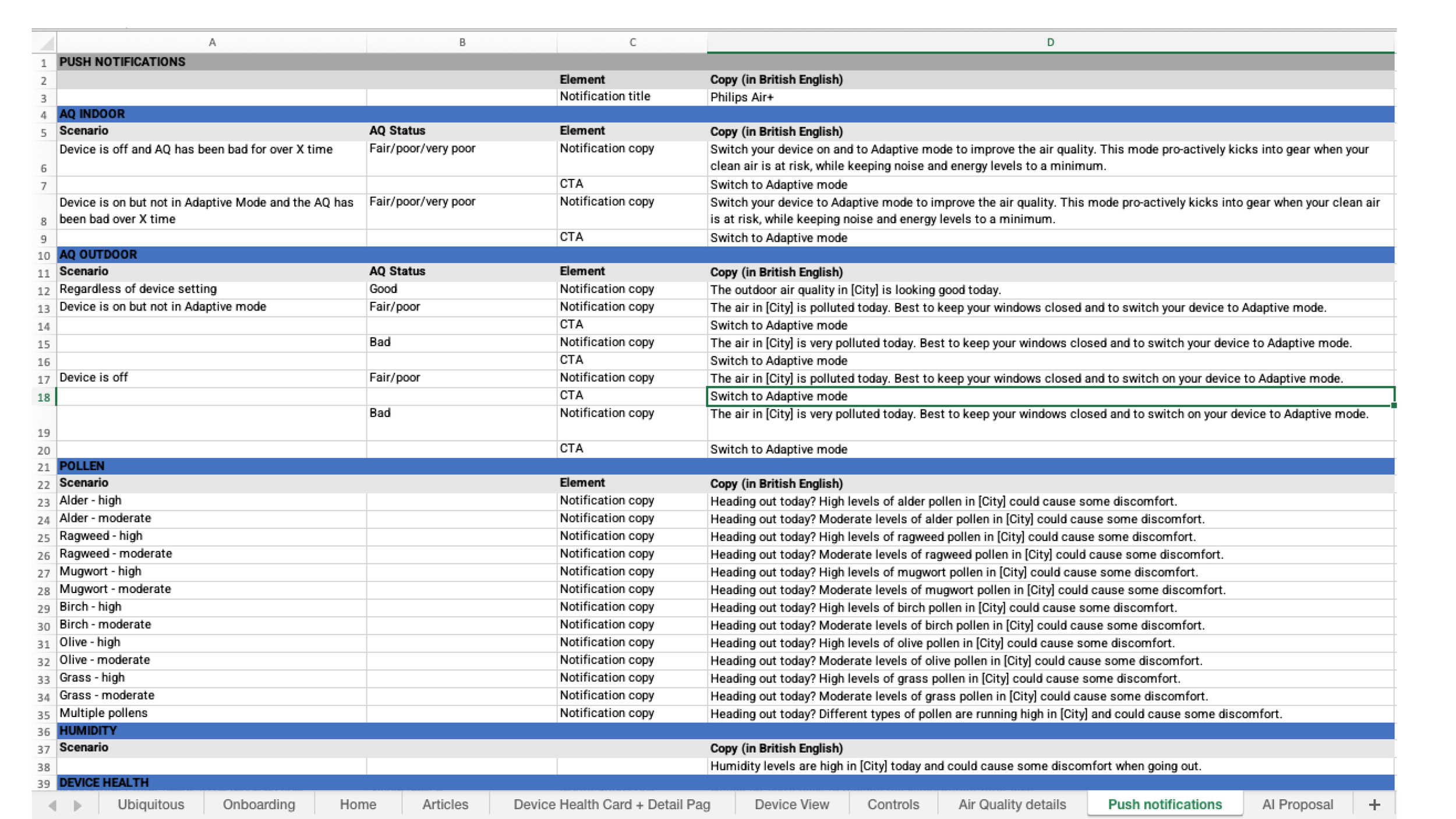
Each sprint was split into a low-fidelity and high-fidelity week, the former to concept a range of executions and the latter to produce detailed designs. As the experience writer, I also delivered an extensive copy matrix for the many different and unique use cases.
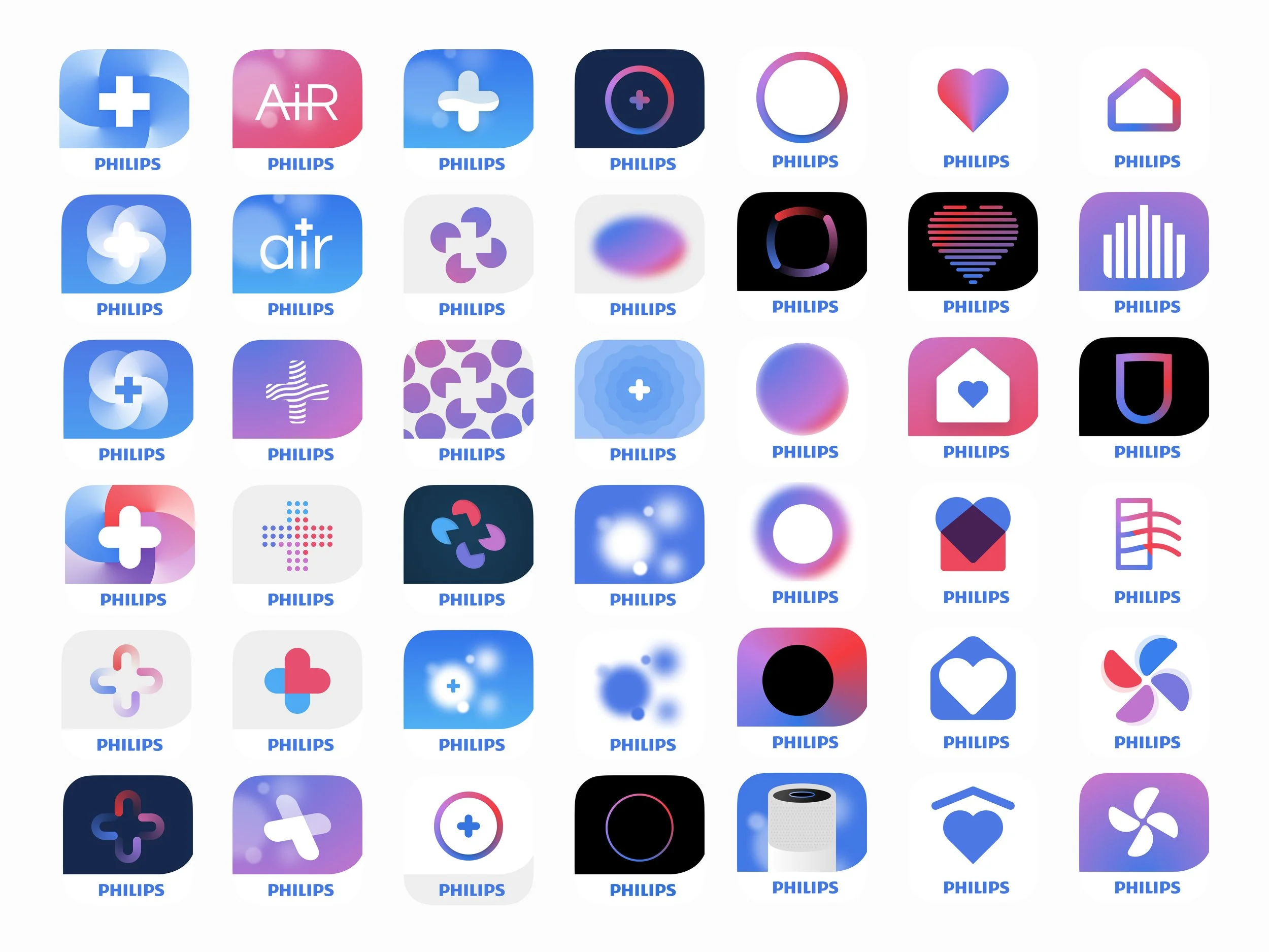
After delivering the MVP, I led a smaller team responsible for renaming the app and designing a matching app icon. Philips Air+ has a 4.3 rating in the Apple app store.